
12:43
Anyone can successfully learn how to use Onshape. It’s all a question of finding the right project for you. Let me show you mine.
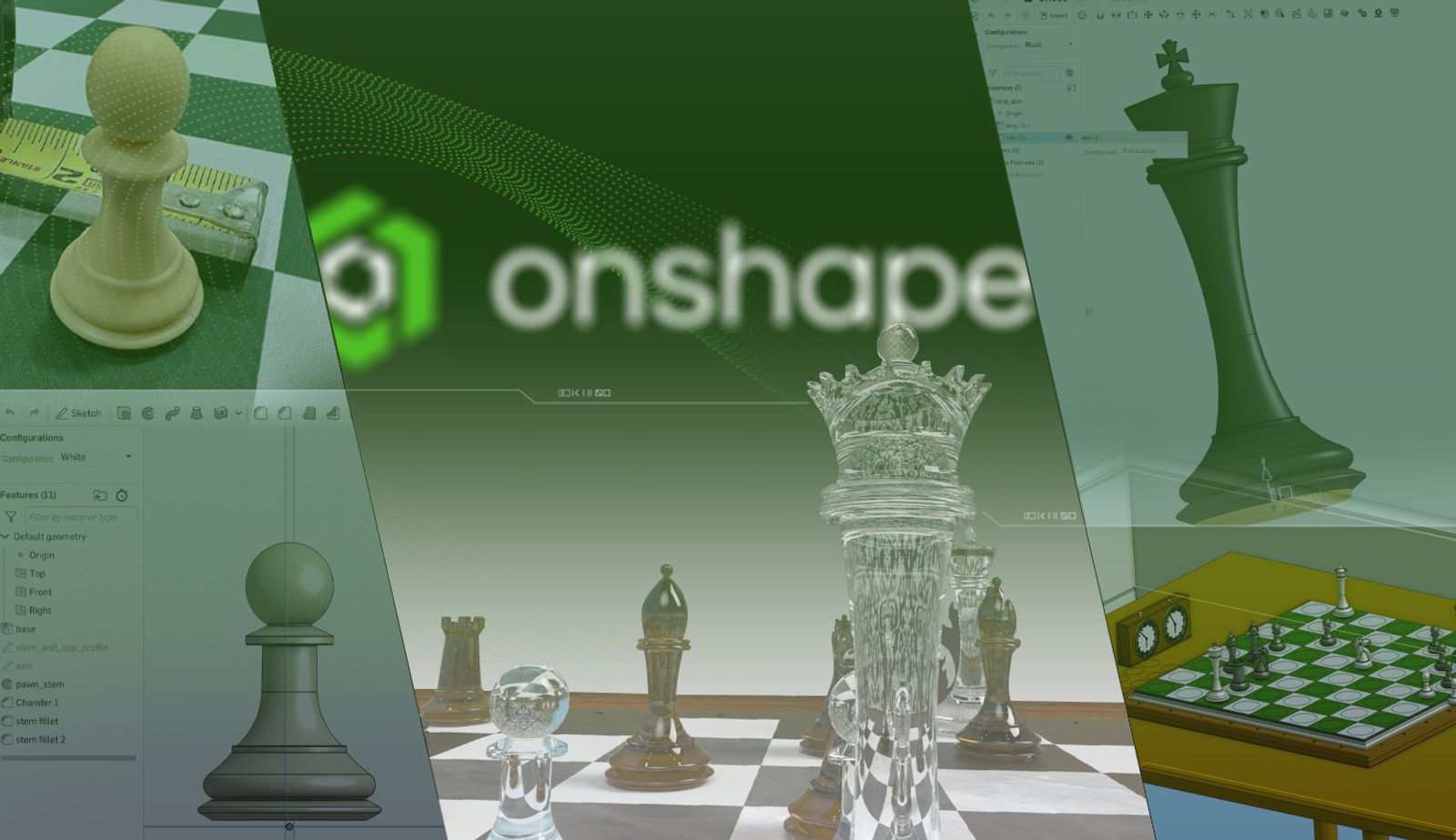
The design process.
The Initial Inspiration to Learn How to Use Onshape
When I joined Onshape, a PTC Technology, this past year as a software developer (more on this at the end), I wanted to improve my modeling skills using this great new tool, but I needed something I was passionate about. What could that be? Going back a couple more years, when I was learning ReactJS, I made an interactive website, “Chess Puzzles.”
Where it all started – I blame “The Queen’s Gambit”.
This was such a rewarding experience, I thought about creating some new graphics to make a 3D version of chess puzzles. What better way to update my modeling skills than to work on a chess set?
Key Onshape Features I Used
Think that chess sets are just revolved sketches – basically taking a few curves through a virtual pottery wheel? They could be, but why settle for that? In building this chess set, I wanted more than the bare minimum, and I used:
- Configurations for sketch diameters, appearances, and base features: I didn’t want just a chess set – I wanted a reusable framework of chess set features that I could adjust and configure with ease. I knew I wouldn’t get everything right the first time, so using Configurations allowed me to organize the various versions of different features, like base sizes, and go back and update what they all have in common easily.
- Derived parts: While each chess piece is different, the bases are all similar. Time for a derived part to standardize how each piece sits.
- Configured assemblies and subassemblies: Want a standard beginning game setup? Want to switch over to the final move in a famous game? Want to swap out a chair rail and baseboard for wainscotting in the room where the chess table is? Assembly Configurations to the rescue!
- Composite parts: Need the best of all worlds in terms of a single body, multiple bodies, and an assembly? For tricky pieces of material with multiple parts, like chess squares, a composite part might be just what you need.
- Radial and linear sketch patterns: An 8x8 grid of squares – we need a good way to manage that effectively if sizes change. Same thing for the clock faces.
- Offset and thicken surfaces: The horse’s mane in the knight? Offset face on the neck and thicken!
- Split face: Used to make all of the assembly mating of the pieces to the board much more effective.
- Draft angles: Instead of cutting material away after creating it, consider tapering it from the start.
- Frames (new this year!): Millwork (baseboards, chair rails, picture frames – the concept has “frame” right in the name). This exciting new feature is just what you need!
- Render Studio (also new this year!): While I love working with drawings and real-time previews to understand the nature of shapes I’m working with, getting a realistic rendering with perspective and vanishing points helps me decide if I’m on track in the general sense in terms of scale, aesthetics, and overall design.
- And more!
I bought a nice tournament-size Staunton-style chess set recently.
Photo Credit: HouseOfStaunton.com catalog
I liked its style enough that I wanted to build it myself, and I made a few design choices early on to help me along the way.
Design Choices
Consistent, reusable design elements instead of exact geometry clones
I decided to take occasional measurements of the chess pieces with a tape measure, but I wasn’t going to buy a set of calipers or scan the pieces. I knew that because of manufacturing artifacts and my own lack of skill in taking measurements, I’d end up with a handful of inconsistent values that didn’t even add up to the overall size of a piece.
I also didn’t want to “trace” the sketches. I broke this rule in one place as you’ll see later, but in general, if I’m not going to make design choices and actually model things, I might as well laser-scan the parts, import the point clouds as triangles, and call it a day, right?
So, I took a few key measurements and created some chess piece bases – sized small (Pawn), medium (Bishop, Rook, and Knight), large (Queen), and extra-large (King). This was a great time to use sketch dimension configurations to keep the design consistent and manageable if I wanted to change it later.
You can see the various sizes I configured for the piece bases. These configurations are then used as derived part bases for the final piece designs. I made black and white configurations as well just so I could tell the pieces apart when setting up game positions as well. Note that I possibly could have used a configuration variable for “Black” and “White” to avoid some of the duplications in the rows above. The “simplified” configurations were for my WebGL chess puzzles site.
Simple geometric building blocks
From the start, I also wanted to aim for using lines and arcs as much as possible and use splines sparingly. I did this because what I wanted more than an impressive, complex curve was something that was consistent across design elements. If I had a spline used in one piece, and I wanted that design element in another piece but modified or scaled a bit, it would be difficult to maintain consistency as well as tangency.
The two arcs with different radii that meet at a tangent point (see the orange highlighted point) are one of my favorite features in the whole project. While there are some tasks that call for a spline, I find that too many fancy curves are distracting, and a complex arrangement of simpler entities gives a more pleasing result.
Avoiding sharp edges
Unless you’re modeling a razor blade, few edges will be truly sharp. Almost every edge in even a relatively boxy object will be slightly rounded or chamfered (either intentionally or because of manufacturing limitations), and it’s worth modeling that. Who knows if you’ll be looking at a model close-up? You’ll want those edges to seem realistic at any scale, right?
This is a habit that has served me well for years. There’s a texture in Onshape Render Studio that can help simulate rounded edges, but I like to model them myself when possible and use that alongside the Render Studio textures.
It’s hard to know where to stop when adding edge details, but all the chamfers here make the model stand out and feel real and solid, not like a video game graphic.
Natural, intuitive features
I alluded to this before, but I wanted to create something beautiful that had very few cheats or hacks. Another thing I decided is if there were certain features I couldn’t model easily and naturally, I’d simplify them. I’d rather go simpler rather than rely on endless Boolean operations or complex lofts I couldn’t properly tweak, resulting in a weird melted blob look. I admit that the knight has a few curves that I drew with help from a photograph.
Still, I knew that my best shot for building something that didn’t look like a tacky imitation of what a wood-carving master would make was to go more abstract. So, I used many extrudes with draft angles and many fillets and chamfers to get a design that actually made sense to me, seemed intuitive and graceful, and wasn’t just a trace, scan, or melted blob.
A Knight’s Tale
Focus on assemblies
You could make a chessboard out of a single planar surface with a stock checkerboard texture. However, a nice chessboard is actually a complex assembly.
Each square is a separate tile. There are tiny gaps between the tiles. The tiles probably rest on some sort of platform. There’s a frame around them binding them in place, and probably a larger supporting base. To achieve the kind of beauty and inspiration I was shooting for, I wanted to make the board out of individual pieces mated together. Plus, individual pieces are much easier to select and manage when coloring and texturing later on.
It’s also easier to make and adjust seams and gaps between pieces that would fit together in real life. In the chess clock assembly, I didn’t want a perfect box that had no way to be taken apart, so I built the top, bottom, front and back separately and mated them with small gaps between them – just like you’d see in real life.
These tiny seams might seem silly, but they’re the difference between something that is real or could be real and a toy.
Big Challenges
Light and dark squares
The board was harder to make than it looks. As I mentioned earlier, I wanted each square to be a separate solid body. However, there are 64 squares.
Do I really want to mate each one to each other and to a frame? I tried a variety of approaches, and another problem I discovered was that I needed an easy way to select all light squares and dark squares at once for texturing, especially since I couldn’t decide on a texture right away.
The solution? I designed a multi-body part with a linear sketch pattern for all the light and all the dark squares and converted each one into a composite part. Then, I just had two interlocking units of bodies to mate into a frame, and I can select all the light or dark squares as one unit.
I am so glad I discovered composite parts – every other strategy I had for managing the squares had downsides I couldn’t live with. With other attempts, I had to either select each face individually for texturing or do horribly tedious mating. The fact that I expose some of the depth of each tile and not just the top surface also made composite parts the right choice.
Mating pieces onto the board and table
With 32 pieces, 64 squares, and a table, there are a lot of places to put the chess pieces. After placing them by hand, I quickly became frustrated – it was way too easy to place them off-centered and below the surface of the board, piercing it in an awkward, ugly collision.
I came up with several strategies. First, I added a centered circle to each square in my chess square sketches (via a sketch pattern). I then used these circles to do a split face feature. The result is that I can then make a cylindrical mate to each square easily – all perfectly centered. Putting everything flat on the board was harder – that just required a large number of planar mates.
One thing that did help was to place related pieces into subassemblies (like white captured pieces or black captured pieces) so that I could turn them on or off to make sorting them out easier.
The split face idea came later, but I’m glad I had a sketch pattern for the squares set up so that I could add in the circles to the pattern. Split faces don’t show up in Render Studio, so don’t worry that you’ll see seams in the final presentation graphics.
Clock face
This was hard to get right – I did some work with radial patterns, and I could get the markers for minutes and hours to line up correctly around the clock face. The numbers were harder since their positions change, but they don’t rotate as they move – they stay upright. Also, each number is different. I had to place these manually. This felt like a little bit of a cheat for me, but if someone has a good suggestion on how to do this efficiently, I’d love to hear it.
Rendering
When it comes to rendering, I don’t have a ton of sage-like advice, but I have a few tips.
Keep it tidy
If you have organized your parts and assemblies well, it will be easier to select parts and faces to add textures, so again, spend more time up-front on this.
An example: Each chess piece is actually an assembly of two parts – the main piece and the felt pad on the bottom mated to it. The felt pad is a separate part so that I can select it more easily and texture it. I could select the felt pad faces individually and texture them, but that would be very time-consuming and tedious with 32 pieces, especially if I change my mind on what color I want.
For the king and other pieces, you could go single body, composite part, or assembly. Assembly was the best choice here, as it allows the most flexibility around accessing individual pieces of geometry. All bodies of a composite part need to be the same texture unless you select individual faces, and then you have the same problem I just mentioned. Taking the time to create a piece of felt and mate it to the bottom of each chess piece saves you time in the long run.
Go fancy, but hold back
The other advice I have is to definitely try out all the super shiny textures that can reflect or refract the light in the entire scene.
This pushes the recursive ray tracing envelope – I love it.
Try these fancy textures out until you get tired of them. Why? Seeing all those reflections is enormous fun, but it’s not totally realistic, and your scene may have a bit of an early 2000s sci-fi CG look. So, consider “matte, dull, eggshell, understated” – if you’re going for “Top Gun”, rather than “Stealth.” Start experimenting with these more conservative surfaces, and you’ll start approaching photo-realism.
Having said that, there’s something to be said for the computer-graphics aesthetic. Just look at the 90s film “The Lawnmower Man” – it’s a look all its own, so don’t be afraid of it, just be aware of it.
Here, I’ve toned things down a bit. You can see the frame has four separate pieces not counting the squares or annotation markings. I selected wood, marble, and hard plastic for the frame, and two contrasting granite colors for the squares – granite also for the pieces. Note that I’ve often scaled and rotated these textures in Render Studio. Some are bitmap-based, so their resolution is not infinite. Be sure to look at how your textures appear in extreme closeups as well as wide shots before committing to them. Finally, give the “Add Rounded Corners” texture a try – it’s a transparent overlay over other textures, and it’s adjustable.
What’s Next?
In addition to all the work I did in Onshape, I wanted to use the chess models in a new context. I exported them to GLTF (Onshape now supports UV coordinates for texture mapping!) and imported them into a separate website I created in Angular to display chess puzzles and chess games:
This was the project that just kept on giving – I can’t wait to see what next chess adventure Onshape will inspire next!
Why I Wrote This
I’ve been working with CAD and 3D-design casually since I was about 11. I started in AutoSketch, then AutoCAD, and POV-Ray in elementary school and high school. In college as a computer science major, in my little spare time, I tried Lightwave3D, SoftImage, Maya, AutoCAD again, and Pro/Engineer. I got to the real world, and used and (worked for) Revit, SOLIDWORKS, Autodesk, and now Onshape.
However, being a hyper-generalist and a software developer by trade, while I develop for CAD and certainly use CAD, design is not my main career focus. Still, I don’t let that stop me, and my message today is that your background shouldn’t stop you either.
Anyone can learn how to use Onshape or improve their Onshape skills. The tool is simply that good and that learnable. All you need is passion, patience, and practice. Your background might be similar to mine or different, but I hope I’ve given you a few strategies for starting a new creative or design project.
Resources
Try Onshape Today
Head to our sign-up page to choose the right CAD plan for you and your team.
Latest Content
- Blog
- Becoming an Expert
- Assemblies
Built to Scale: Why Large Assemblies Don’t Slow Down in Onshape
07.16.2026 learn more- Blog
- News from Onshape @ PTC
- Artificial Intelligence
Onshape Labs: AI in CAD Guided by Designers, Driven by Innovation
07.15.2026 learn more- Blog
- Evaluating Onshape
- Data Management
- Collaboration
- Artificial Intelligence
How the Most Underrated CAD Feature Improves Design Workflows
07.09.2026 learn more